I come to bury Caesar, not to praise him.
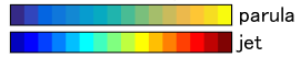
MATLAB's newest version has finally tossed the jet default colormap for parula.
The visualization community has long been warning against the use of "rainbow" colormaps like jet. Today I looked around for some of the papers articulating why.
The well-cited, "Rainbow Color Map (Still) Considered Harmful" by David Borland and Russell M. Taylor II presents synthetic counterexamples, highlighting why the "Rainbow" colormap should be avoided.
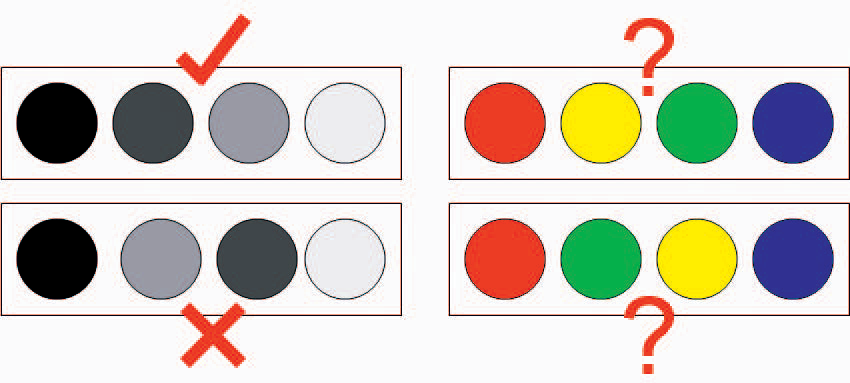
The first counterexample cites the book Information Visualization: Perception for Design by C. Ware. From the text in [Borland and Taylor], it seems this book contains details of a perceptual study in which subjects correctly order grayscale paint chips consistently but often fail to order "rainbow" paint chips (presumably by hue).
Borland and Taylor go on to write,
Some even put them in alphabetical order. To put them in the so-called correct order, most people must remember Roy G. Biv (red, orange, yellow, green, blue, indigo, violet), or some other mnemonic representation of the order of colors in the rainbow.
I was a bit surprised. I'm quite accustomed to matlab's jet and would have never chosen the order red, green, yellow, blue. I could admit that perhaps I'm perceptually faster at ordering grayscale colors that hue-based spectra. So I went digging in the Ware book to find the original study to find more details.
In Chapter 4, Application 3 "Application 3: Color Sequences for Data Maps" Ware cites an earlier paper of his called "Color Sequences for Univariate Maps: Theory, Experiments, and Principles". This paper contains three small scale studies providing evidence against chromatic sequences: one quantitative study and two qualitative survey-style studies. The studies and results are aimed specifically at a pseudocoloring's ability to represent a height field or surface.
The other cited study is "Face-based Luminance Matching for Perceptual Colormap Generation" by [Kindlmann et al.]. This paper seems to contain a user study regarding their proposed system for luminance calibration and doesn't seem directly related to Ware's claim that "Experimental studies have confirmed that grayscale maps are much better for form perception."
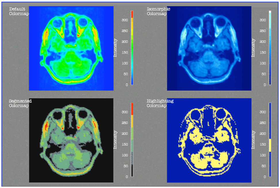
Their more papers cited in "How NOT to Lie with Visualization" by [Rogowitz and Treinish] backing the finding that the "[rainbow hue colormap] produces several well-documented artifacts". Some of these artifacts are convincing without a perceptual study: e.g. focus is drawn to bright, yellow regions of this MRI while subtleties are drown out in the large green span in the spectrum:
OK. But I'm still left wondering about this paint chip study.
Question: Is there no large scale study quantitatively confirming the perceptual limitations of the rainbow colormap?
Maybe now that Matlab's changed its default everybody (including probably me) will just stop using it out of laziness and we won't need to worry about verifying these claims empirically.
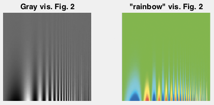
I continued through "Rainbow Color Map (Still) Considered Harmful" by David Borland and Russell M. Taylor II to the second counterexample. Here an scalar field varying frequency is mapped to a grayscale colormap and a rainbow" one:
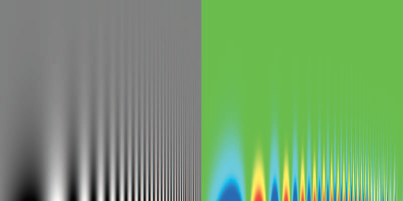
This example immediately puzzled me. Why is so much lost in the green? I would not expect to see this in matlab using either its jet or hsv rainbow colormaps.
Indeed, this counterexample seems particular the choice of "rainbow" colormap.
As a testament to the simplicity of the grayscale colormap, we can directly recover the underlying scalar field by taking the intensity value of the grayscale image in Fig 2 left. Using this, we can recover the colormap used for the "rainbow" visualization from their Fig 2 right. Then, to verify I reproduce the input in matlab above.
Now, I can easily try other colormaps like jet and hsv:
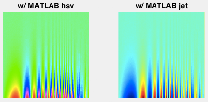
Neither suffer from the washout of the original "rainbow" visualization. Though there's plenty of room to argue about whether too much attention is drawn from the vertical stripes to the extrema values on the bottom.
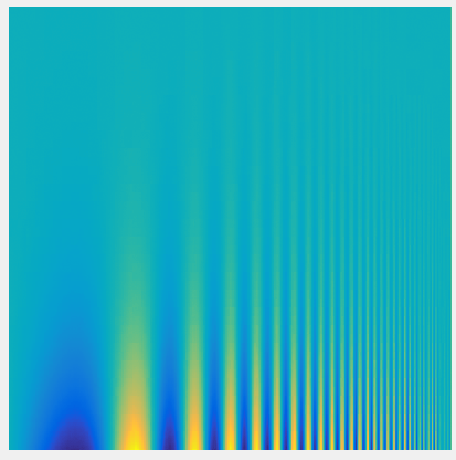
Looking at just this scalar field makes it difficult to judge the colormaps being used. Here I've taken the domain of scalar values (roughly 0 to 250) linearly and applied colormap:
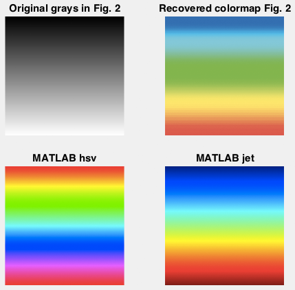
The top right shows the recovered "rainbow" colormap. Notice the wide range of green values and lack of purple values.
Figure 3 in the same paper shows a "rainbow" colormap with a wider gamut (left):
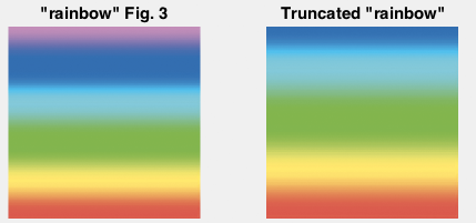
The recovered colormap seems is well approximated by a truncated versioned of this wider colormap (right).
If we apply the full "rainbow" from Fig 3 to the original data we get a bit more reasonable visualization (left):
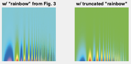
whereas the truncated colormap produces a washed out visualization (right) similar to the original one in Figure 2.
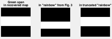
It seems rather obvious that using a colormap with such a wide span covered by essentially the same green will be troublesome. Here're the spans in the recovered colormap, the full "rainbow", and the truncated rainbow which are within 30.72 RGB8 units from the central "green" value:
The jet and hsv colormaps don't contain this same green. hsv seems to suffer from a similar problem, but jet to a much lesser degree (more cyan-ish colors). This finding seems to agree with the [Kindlmann et al.] idea that there are "good" rainbows and "bad" rainbows. Though it doesn't quite count as evidence that all rainbows are bad, (even if we all know that they must be).
To come full circle, here's that dataset visualized with MATLAB's new parula colormap:
I'm sold on it. I agree with Robert Kosara's explanation why rainbows are popular:
Given the issues, why are the rainbow colormap and its variants so popular? I think the answer is quite simple: it’s attractive. Using a single hue to show the data would be reasonably effective, but much less interesting to look at.
parula seems to offer a decent trade-off. I don't think I'll mind staring it from now on. Perhaps, I'll still silently long to see those other hues of the rainbow.